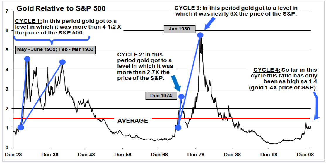
?Gold is making headlines as it continues to push into record territory. Many are starting to speak about gold being overbought and in bubble territory. I found a very interesting chart that attempts to frame an answer to the gold bubble question. The chart below from John Rogue of WJB Capital points to the price of gold relative to the S&P 500 as far back as the 1920s. I think it clearly substantiates my outlook regarding gold’s future value.
Source: It takes two to make a thing go right, By: John Roque, WJB Capital Group. Inc., Technical Review May 17, 2010
It makes sense to compare gold to other investments to get a relative value. The chart shows that in the deflationary 1930s, gold reached 4.5 times the value of the S&P 500. In the inflationary 1970’s and 1980’s, gold was anywhere from 2.7 times to 6 times the value of the S&P 500. So far in this economic crisis, gold has only risen to 1.4 times the value of the S&P 500. Another item to note in the chart is the red line that shows we are currently under the average for the gold to S&P 500 ratio. A final item to note is that gold has done well in both inflationary and deflationary periods. That is good news because our economy is still shaky enough that it could go either into either scenario.
Considering the gravity of the state of global economics, the race to cheapen currencies, and the debt levels of western economies, it would be no surprise to see gold and other precious metals continue to climb.
Would you like an analysis of your current investment portfolio? Call me to schedule your free consultation- 913.693.7918.
John P. Chladek, MBA, CFP® is the President of Chladek Wealth Management, LLC, a fee-only financial planning and investment management firm specializing in helping families and couples who are not yet retired realize their financial goals. For more information, visit http://www.chladekwealth.com.
